Case study
Design System
A scalable Figma design system for an Australian Telecom Provider with reusable components, design tokens, and accessibility standards to improve consistency and streamline design to development collaboration.
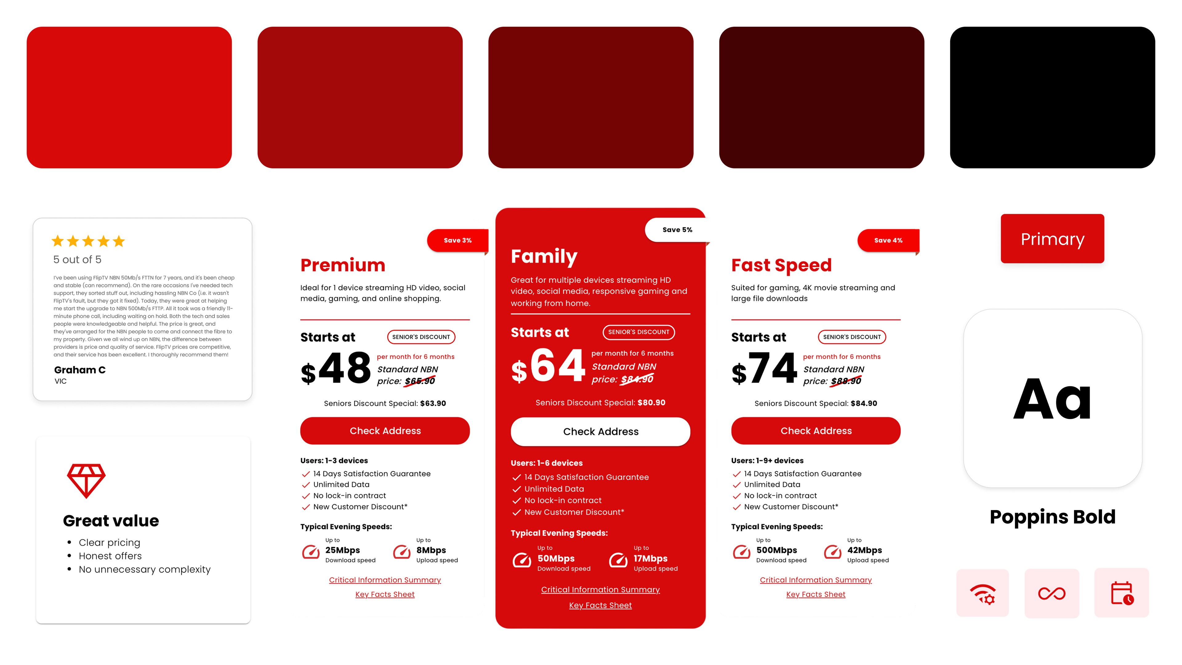
Designed and established a Design System for an Australian Telecom Provider, creating reusable UI components, design tokens, and documentation to improve consistency, scalability, and collaboration across digital products.
- MY ROLE
- Design System, UI Design, Documentation
- PROJECT
- Internship
- TOOLS
- TEAM
- 2 Person Design Team
overview
Why I created the design system
Before the design system, the interface lacked consistency in colours, typography, spacing, and reusable components, leading to an inconsistent user experience and slower design workflows. To address these challenges, I designed a scalable design system that established a unified visual language through standardized colours, typography, design tokens, and reusable components, improving consistency, collaboration, and efficiency across the product.
* This case study presents selected aspects of my contribution. Confidential and proprietary information has been omitted.
About the company
This Design System for an Australian Telecom Provider supports a company that offers affordable NBN and mobile plans through a digital-first platform. With a focus on simplicity, transparency, and customer convenience, the brand aims to make purchasing and managing internet services intuitive and hassle free. As the product expanded, maintaining consistency across its digital experiences became increasingly important, leading to the development of a scalable design system.
Design System
Colour
The colour system was designed to establish a consistent and accessible visual language across the product. I created a structured palette consisting of primary, secondary, gradient, and link colours, each with clear usage guidelines to reinforce the brand identity, create visual hierarchy, and support intuitive user interactions. By standardising colour usage throughout the interface, the system ensured consistency, improved usability, and provided a cohesive experience across all digital touchpoints.
I also made sure colour combinations were 100% WCAG 2.1 level AA compliant so that the design system creates products that are accessible to everyone.
Primary colours
#000000
Primary 1
#D70A0A
Primary 2
#FFFFFF
Primary 3
Secondary colours
#D2D2D2
Secondary 1
#F7CECE
Secondary 2
#131313
Secondary 3
#323232
Secondary 4
Gradient & links
#4E0000 → #B40000
Gradient
#888888
Link colour
Typography
Typography was defined to create a clear visual hierarchy and improve readability across the company's digital products. I established a structured type scale with consistent font sizes, weights, and line heights for headings, body text, navigation, and buttons, ensuring content remains legible and accessible across different screen sizes and contexts.
Primary typeface
Poppins
Poppins is used across all product interfaces from marketing pages to product screens with a clear scale for headings, body copy, navigation, and buttons.
Font family
Aa
Poppins Bold
Aa
Poppins Semi Bold
Aa
Poppins Medium
Aa
Poppins Regular
Font size
Headings
H1
Bold · Size: 44
Heading 1
H2
Bold · Size: 42
Heading 2
H3
Bold · Size: 40
Heading 3
H4
Bold · Size: 36
Heading 4
H5
Bold · Size: 28
Heading 5
H6
Bold · Size: 22
Heading 6
Body text
Body Text 1
Regular · Size: 27
Body Text 1
Body Text 2
Regular · Size: 22
Body Text 2
Body Text 3
Regular · Size: 20
Body Text 3
Body Text 4
Regular · Size: 18
Body Text 4
Body Text 5
Regular · Size: 14
Body Text 5
Body Text 6
Regular · Size: 10
Body Text 6
Nav text
Nav Selected
Bold · Size: 20
Nav Selected
Nav Regular
Medium · Size: 18
Nav Regular
Button text
Button Text 1
Bold · Size: 27
Button Text 1
Button Text 2
Bold · Size: 24
Button Text 2
Button Text 3
Bold · Size: 22
Button Text 3
Button Text 4
Bold · Size: 20
Button Text 4
Icons
The design system includes a unified icon library with clear usage guidelines for navigation, actions, product features, and interface states. This ensures consistency, improves recognition, and creates a seamless experience across the product.
Search
Account
Menu
Arrow up
Arrow down
Chevron left
Chevron right
Person
Call
Help
Support
Cancel
Star
Diamond
Home shield
Check box
Home
Wifi
Done
Info
Lock
Location
Buttons
A comprehensive button system was created to support consistent interactions throughout the interface. Variants including primary, secondary, outlined, and on-dark were designed with clearly defined interaction states, helping establish visual hierarchy, improve usability, and maintain consistency across the product.
◇ Primary
default
hover
pressed
disabled
◇ Outlined
default
hover
pressed
disabled
◇ Secondary
default
hover
pressed
disabled
◇ On dark
default
hover
pressed
disabled
◇ With icon
default
hover
pressed
disabled
Shadows
A consistent elevation system was developed using reusable shadow tokens that enhance depth and guide visual hierarchy. By defining a small range of shadow levels, components maintain a cohesive appearance across marketing pages and product interfaces while preserving the brand's clean, modern aesthetic.
Elevation
Shadow 1
X: 0 · Y: 1
Blur: 3 · Spread: 0
#000000 · 8%
Shadow 2
X: 0 · Y: 2
Blur: 8 · Spread: 0
#000000 · 10%
Shadow 3
X: 0 · Y: 4
Blur: 16 · Spread: 0
#000000 · 12%
Shadow 4
X: 0 · Y: 8
Blur: 24 · Spread: 0
#000000 · 16%
Focus & overlays
Focus ring
X: 0 · Y: 0
Blur: 0 · Spread: 3
#D70A0A · 35%
Modal overlay
X: 0 · Y: 12
Blur: 40 · Spread: 0
#000000 · 24%
Project Outcomes
50+
Reusable components with multiple variants and states
30+
Component variants designed
80+
Design tokens for colours, typography, spacing, and elevation
Reflection
01
Foundations decide everything else
Getting colour and hierarchy right early made the component library easier to expand without creating conflicting patterns.
02
Systems should feel fast to use
A design system fails if it slows designers down. Properties, clear tokens, and example screens matter as much as visual polish.
03
Accessibility is part of brand
The brand's bold red identity only works if contrast and clarity hold up across light docs and dark product surfaces.