Case study
Little Sprout
A pregnancy tracker app that helps parents monitor health, stay supported, and communicate with care teams
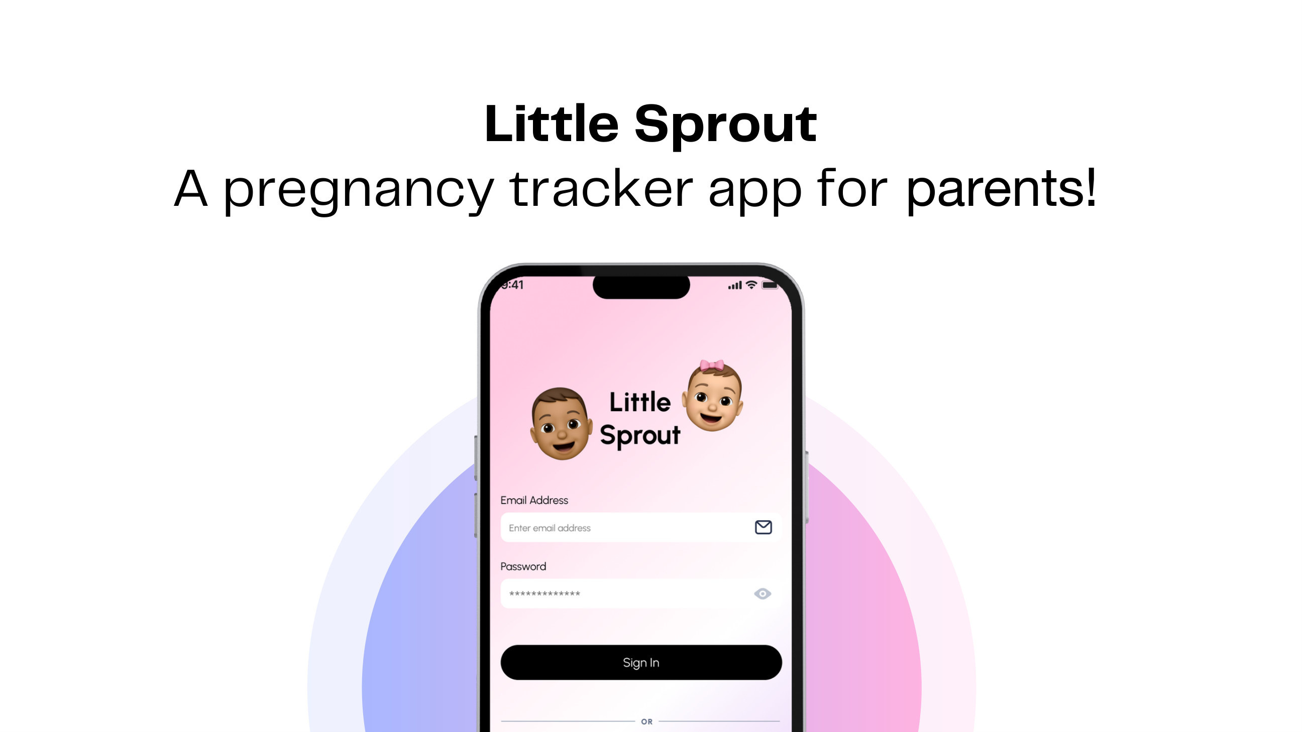
Creating a service or a system that provides a safe space and continuous monitoring for pregnant women throughout their trimesters which facilitates seamless communication with their doctors and can get help instantly.
- MY ROLE
- Research, Product Strategy, Testing, UI/UX Design and Prototyping
- DURATION
- 10 Weeks
- TOOLS
- TEAM
- Individual



overview
Introduction
Little Sprout is a pregnancy tracker where users can monitor health data, record symptoms, manage medicine and appointments, and access emotional and practical support throughout pregnancy. Partners and caregivers can also stay informed and take a more active role in the journey.
The Problem
Pregnant women in the USA often find it difficult for them to have a record of what the doctors told them during their consultation.
Problem Statement
Pregnant women in the USA face stress and health risks due to the lack of a centralized system for accessing medical records, tracking symptoms, and having any support related to care and wellness.
When patients and their family members cannot have access to their record or any data regarding their whole pregnancy journey it leads to anxiety and chaos amongst them. There is a lack of seamless communication among doctors, patients, family members and hospitals. The whole process becomes difficult and cumbersome where they cannot schedule appointments, track their symptoms and detect any health risks beforehand. Without a centralized system the health and well-being of the mother and the unborn baby is at risk.
How Might We
How might we create a safe and supportive system that continuously monitors pregnancy, keeps medical information accessible, and helps mothers communicate seamlessly with doctors and caregivers?
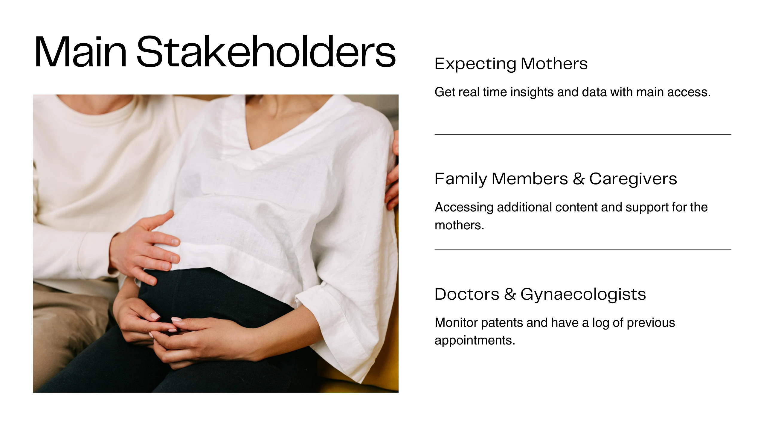
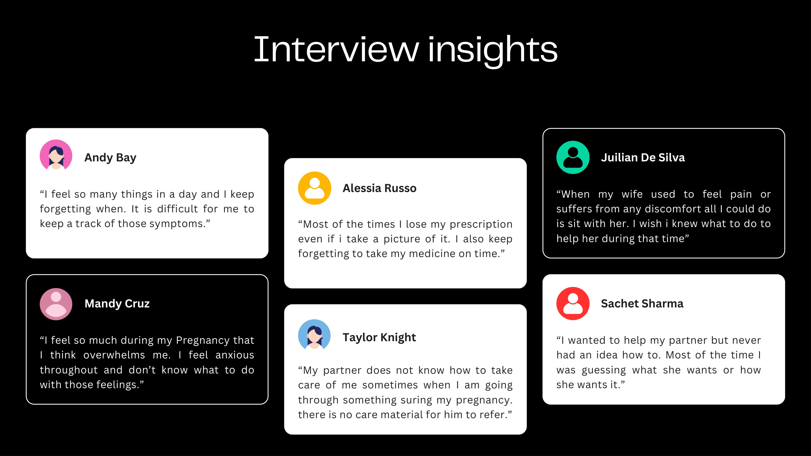
Research · Interview
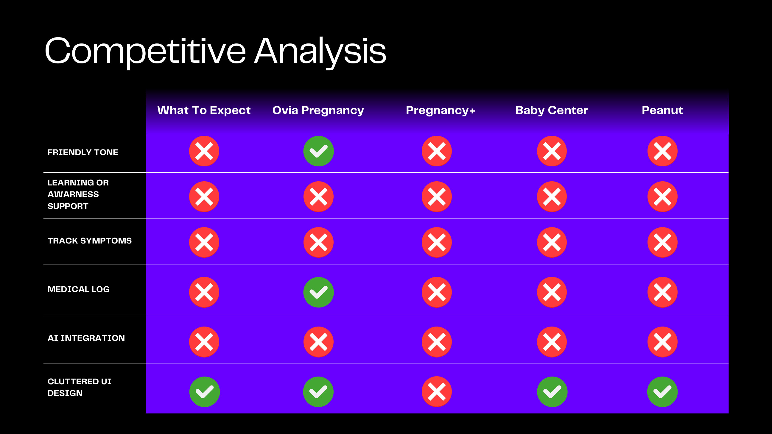
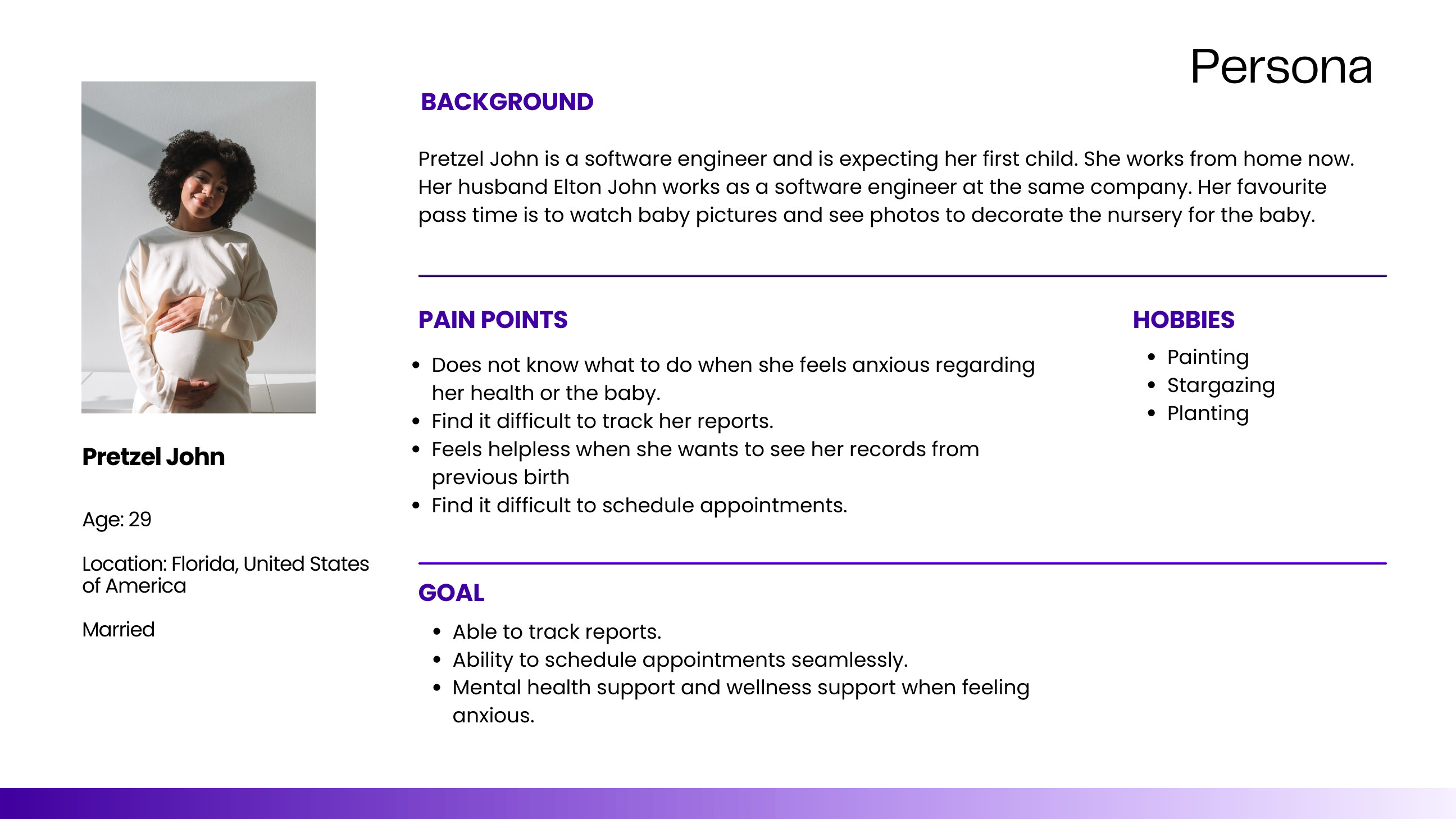
Research · User Persona
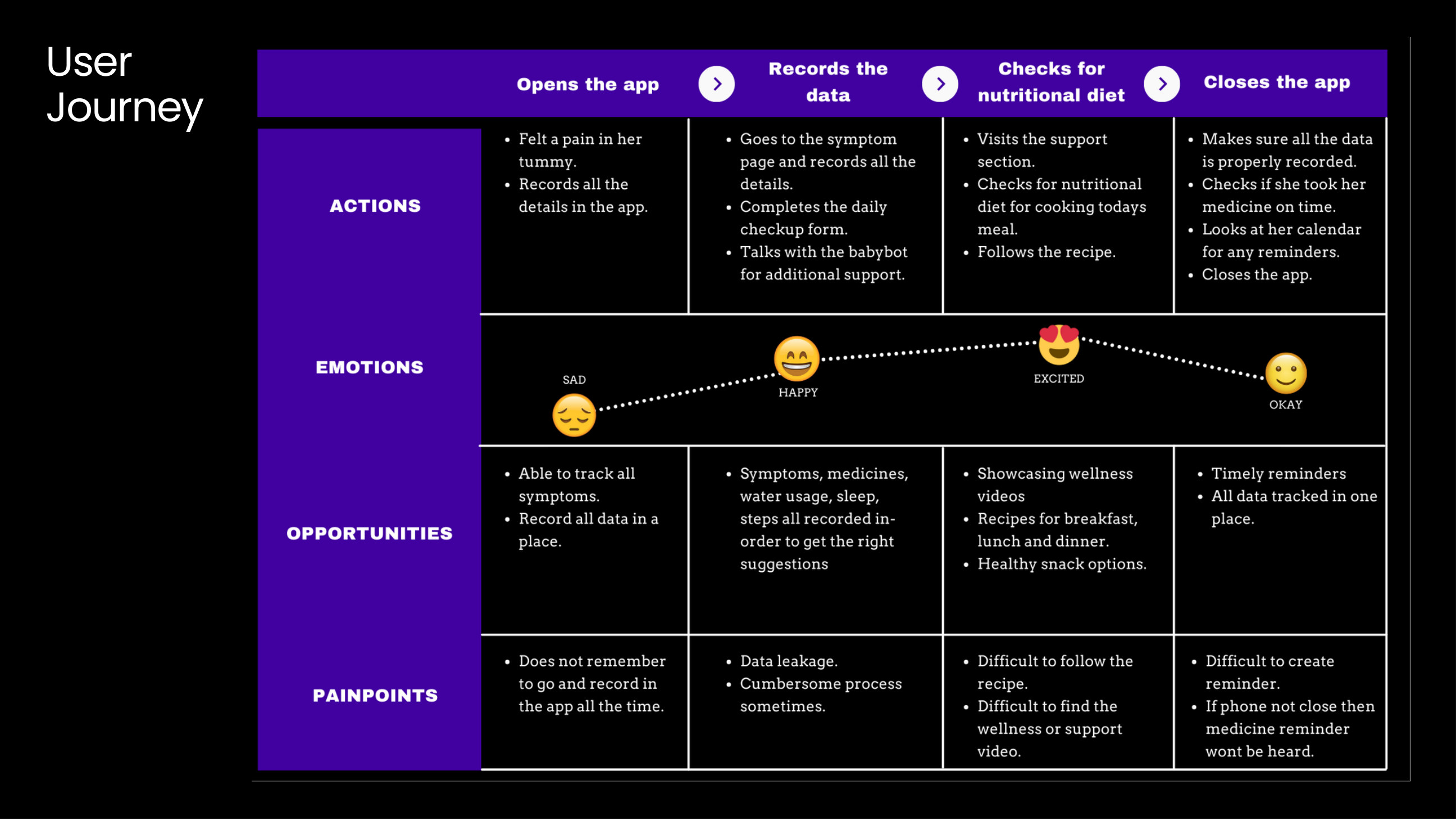
Research · Journey Mapping
I mapped the user's journey to understand their experiences, emotions, pain points, and opportunities where my solution could provide meaningful support throughout their pregnancy.
Research · Needs and Functions
Based on my user research and interview insights, I identified the key needs of expecting mothers, their partners, and healthcare providers. I translated these insights into core product functions that would simplify pregnancy management while reducing stress and uncertainty.
- 1.Identified the need for a centralized platform to access medical records and pregnancy information in one place.
- 2.Designed a symptom and health tracking system to help users monitor their wellbeing throughout each trimester.
- 3.Included medicine, nutrition, and appointment reminders to support healthy daily routines.
- 4.Created features that enable partners and caregivers to stay informed and actively participate in the pregnancy journey.
- 5.Integrated AI powered support to answer common pregnancy questions and provide instant guidance.
- 6.Developed clear data visualizations to make health insights easy to understand and share with healthcare professionals.
- 7.Added educational resources and wellness content to support both expecting mothers and their families.
- 8.Focused on creating an intuitive, user-friendly experience that reduces stress and simplifies pregnancy management.
Low Fidelity
- 1.Created low fidelity wireframes to quickly explore the overall layout, user flow, and information architecture before focusing on visual design.
- 2.Used these wireframes to validate core functionality and iterate on ideas early in the design process.
Mid Fidelity
I refined the low fidelity wireframes into mid fidelity prototypes by incorporating realistic content, clearer layouts, and intuitive interaction patterns. Through iterative design improvements, I enhanced the usability and overall user experience while validating key user flows. These prototypes established a strong foundation for the final high-fidelity interface and helped ensure the design effectively addressed user needs.
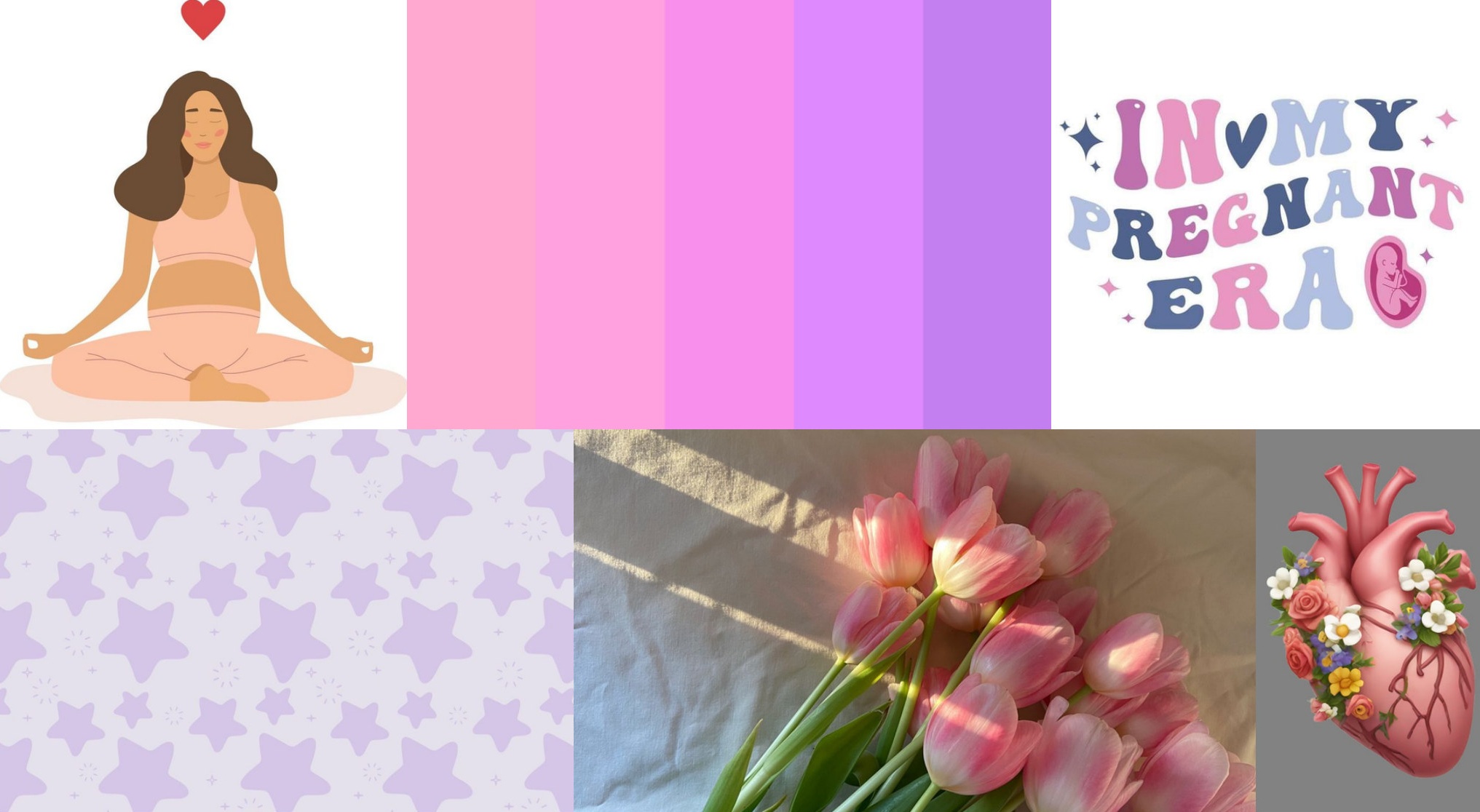
Mood Board
I created a moodboard to define the visual direction of the product, focusing on a calm, supportive, and trustworthy experience through colours, typography, and imagery.
Research · Usability Testing
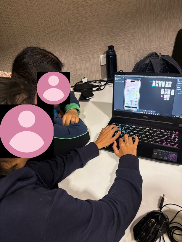
Gathering feedback
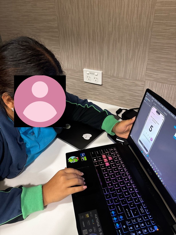
Tested the app with 4 users who are in the age group of 23–26. They performed an explorative user testing.
| Name | Gender | Age |
|---|---|---|
| Farhana S | F | 23 |
| Ananya Shekar | F | 26 |
| Tanya B | F | 25 |
| Nayanka Patil | F | 26 |
The following feedback was received by the participants:
- 1.“What if the parents do not want to decide on the baby gender during selecting one at the baby bot.”
- 2.“Really liked the idea of medicine streak which reminds me of Duolingo.”
- 3.“What will happen if there is twins?”
- 4.“I want to share my progress with other people as an achievement.”
- 5.“I want to have an emergency help button incase I want to call someone or my partner while I am accessing the app.”
Final Design
Incorporating research & design elements
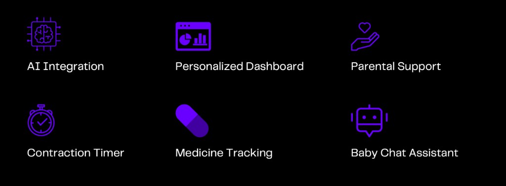
I designed Little Sprout, a pregnancy tracking application that provides expecting parents with a centralized platform to monitor their health and wellbeing throughout pregnancy. The app enables users to track symptoms, monitor key health metrics, compare the baby's growth using relatable objects, access wellness resources, and receive AI powered support through the Baby Chat Assistant. By combining health tracking, educational content, and personalized guidance, the final design creates a seamless, supportive, and user-centred pregnancy experience.
High Fidelity
The final interface is focused on creating a calm, supportive, and user friendly experience while ensuring seamless navigation across key features such as symptom tracking, health monitoring, AI powered assistance, and wellness support.
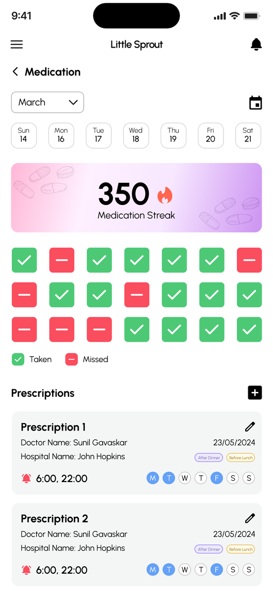
Medicine Log Page
Prototype
Design Decisions
01
Relatable baby size comparisons
Instead of relying only on fruit and vegetable comparisons, the design uses everyday objects that feel more familiar and relevant to the current generation.
02
Typography and colour choices
Urbanist was selected for its sleek, approachable sans serif character. A baby pink to purple gradient communicates gentleness, innocence, devotion, and care, supported by black and white as primary colours.
03
Inclusive, expressive memojis
Memojis create a modern and personal feel, make emotional expressions easier to read, and give the experience a more inclusive 3D visual language.
Reflection
01
User research shaped my design decisions
Conducting interviews and analysing user pain points helped me prioritize features that addressed real challenges faced by expecting mothers and their support network.
02
Iteration improved the overall user experience
Progressing from low-fidelity wireframes to high-fidelity prototypes allowed me to refine navigation, information hierarchy, and interactions based on continuous evaluation and feedback.
03
User testing highlighted opportunities for future improvements
Feedback such as adding an emergency help button, supporting multiple pregnancies, and expanding personalization reinforced the importance of designing flexible, inclusive, and user-centred experiences.