Branding
Talhive Branding
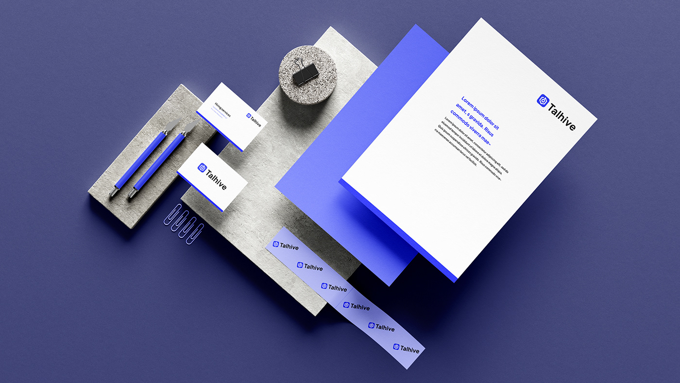
A logo and visual identity for a human capital firm that finds talent who fit both the role and the culture.
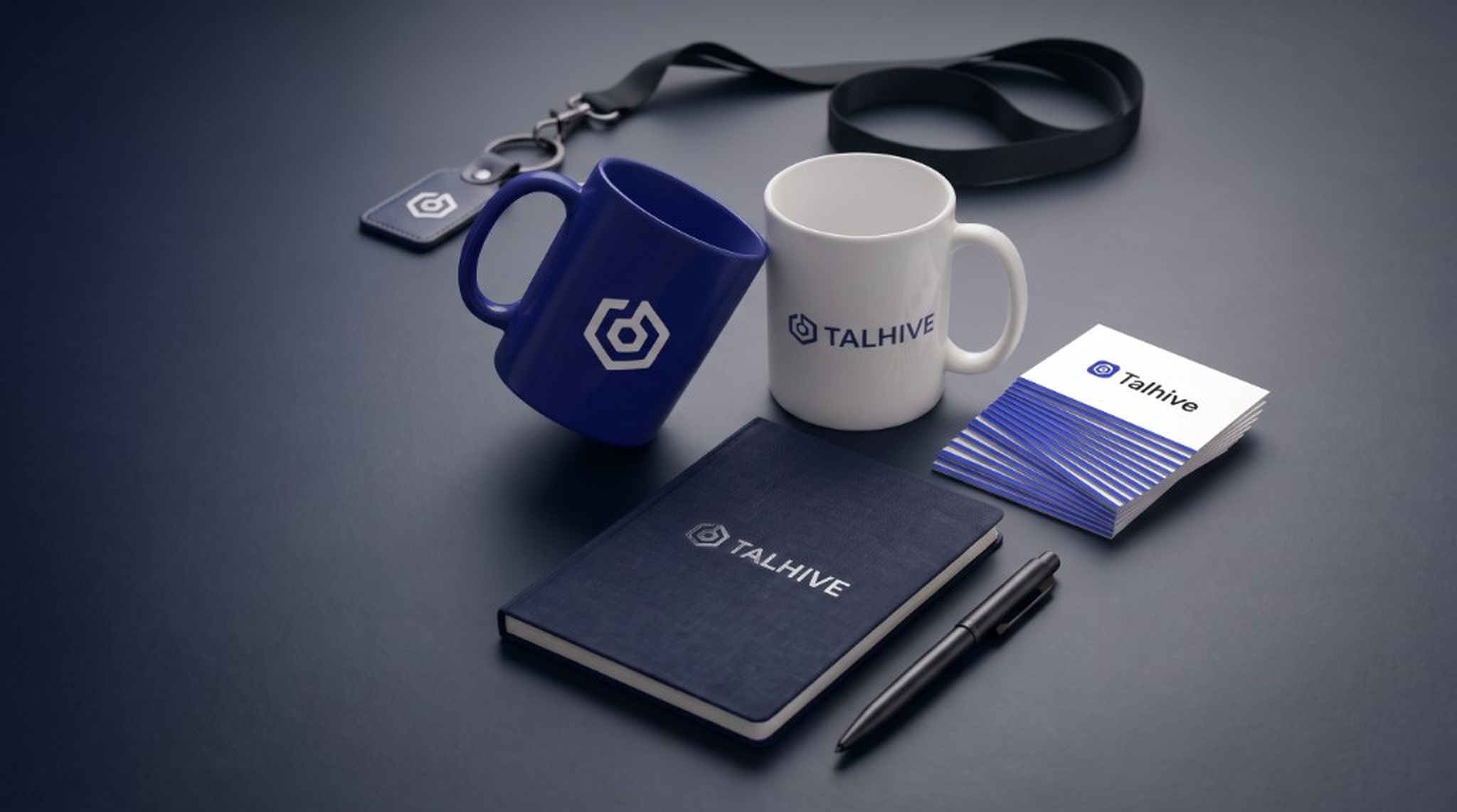
Talhive is a Human Capital Management firm that helps companies attract, hire, develop, and retain top talent.
- My Role
- Brand Identity, Logo Design
- Duration
- 3 months
- Tools
- Client
- Talhive HR Management LLP
They work with high growth technology companies to build teams across revenue, executive, and technology functions. By connecting businesses with the right people and building cohesive, high performing teams, Talhive helps companies scale and accelerate growth.
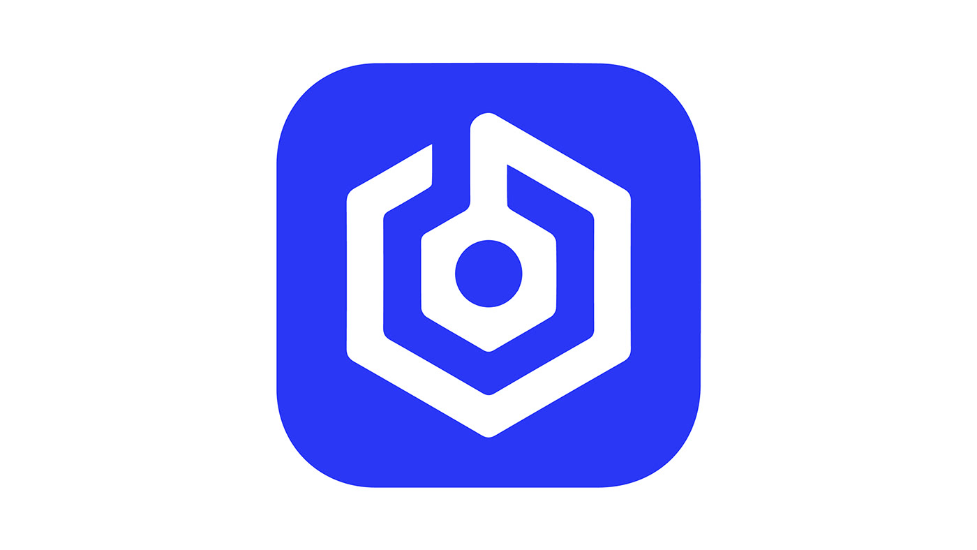
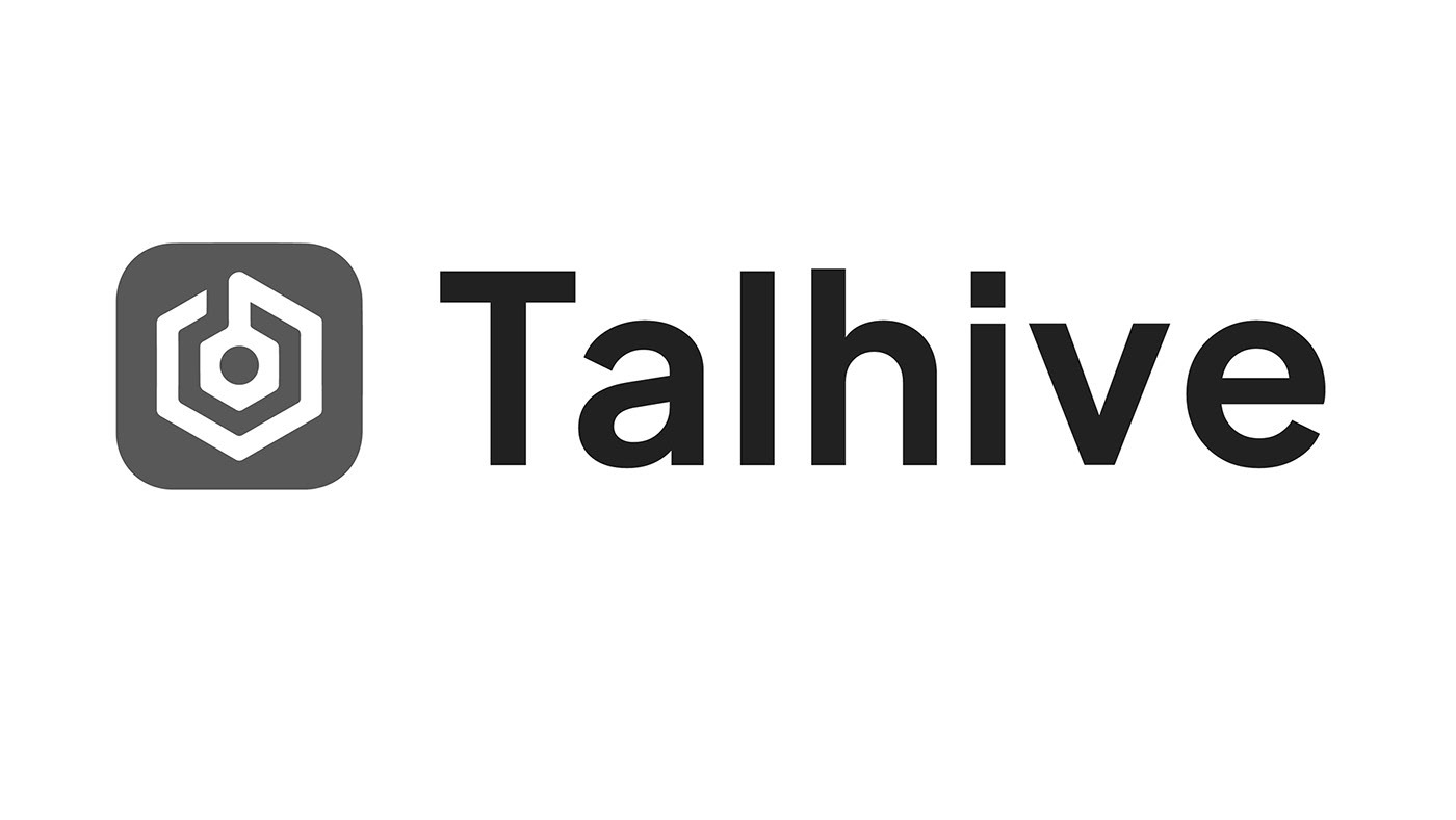
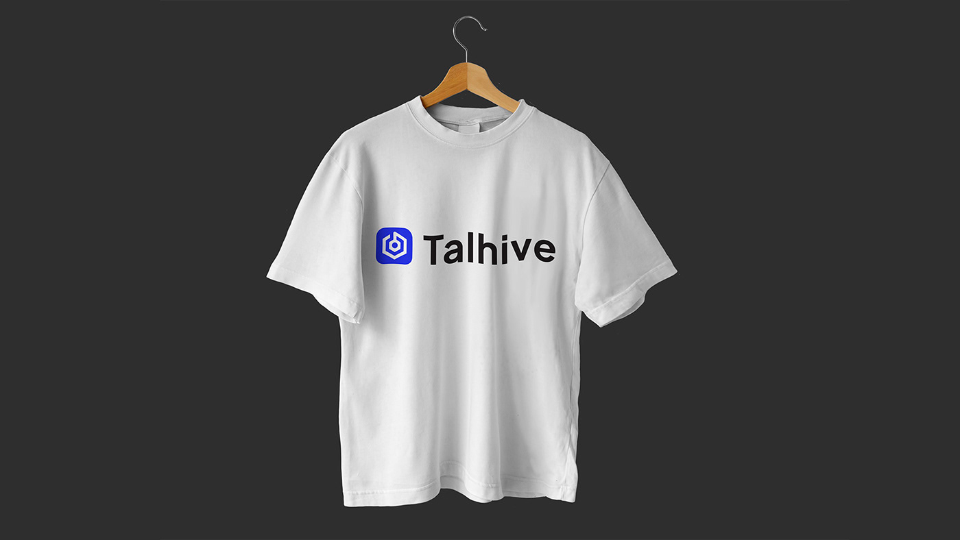
The Talhive logo combines two ideas at the heart of the business: search and community.
The outer form is inspired by a hive, representing people, connection and a collective working environment. Within it, I integrated an inverted search symbol using negative space representing the process of finding the right talent.
Together, the two forms communicate Talhive's approach to recruitment: searching for people whose skills and personality fit the organisation.
Talhive
HEX: #000000
Talhive
HEX: #2A37F5
Primary typeface
Plus Jakarta Sans
Plus Jakarta Sans is the Talhive typeface — Bold for the wordmark and headlines, Regular for supporting copy.
Font family
Aa
Plus Jakarta Sans Bold
Aa
Plus Jakarta Sans Regular
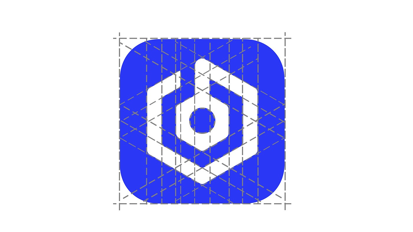
I explored different ways of combining the two core ideas without making the symbol feel like two separate icons placed together. The final direction uses the search form as negative space within the hive structure, creating a single, recognisable mark.
Hive
People · community · culture
Search
Discovery · talent · opportunity
Together
Finding the right fit
Design Decisions
The biggest challenge was keeping the mark recognisable without making either concept too literal.
The early explorations relied heavily on recognisable search and honeycomb shapes. The final direction became stronger when the two ideas were treated as one visual system rather than two separate symbols.
This helped the logo move away from a generic recruitment aesthetic and towards a more distinctive brand mark.