Case study
Tea Branding
Brand Identity & Catalog Design
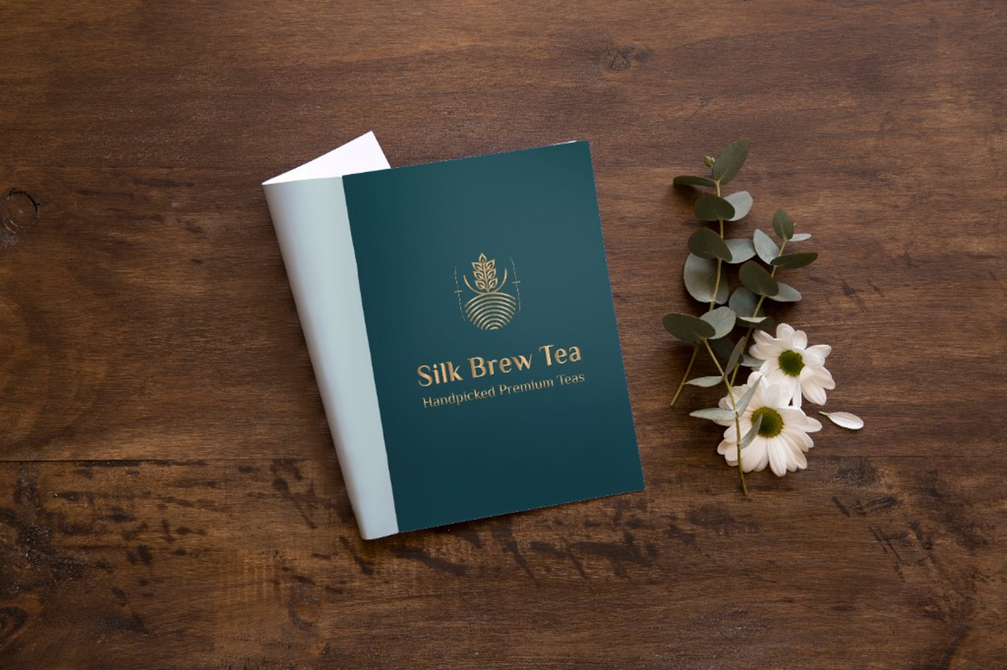
A visual identity, catalog and packaging design exploring how tea can be presented through a balance of editorial typography, considered colour, imagery and cohesive product presentation.
- MY ROLE
- Brand & Graphic Designer
- DURATION
- 3 Months
- TOOLS


Visual Identity
Colour Palette
I chose a distinct colour palette to differentiate the tea varieties while maintaining a cohesive visual identity across the catalogue.
Typography
I retained the company’s existing typeface to preserve brand consistency, balancing editorial expression with clear, readable product information.
Graphic Language
I established a consistent graphic language across the catalogue spreads to create visual continuity and give the collection a distinctive, recognisable character.
Forest
HEX: #104040
Gold
HEX: #B09060
Sand
HEX: #D0A090
Plum
HEX: #301040
Burgundy
HEX: #601010
Leaf
HEX: #406030
Navy
HEX: #004070
Paper
HEX: #F7F4EF
Packaging Design
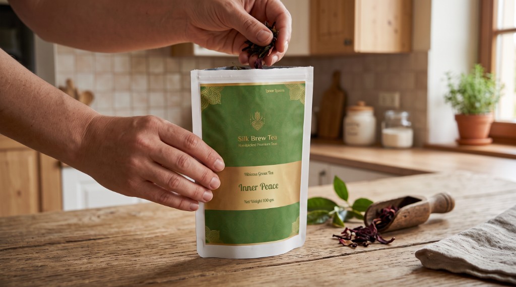
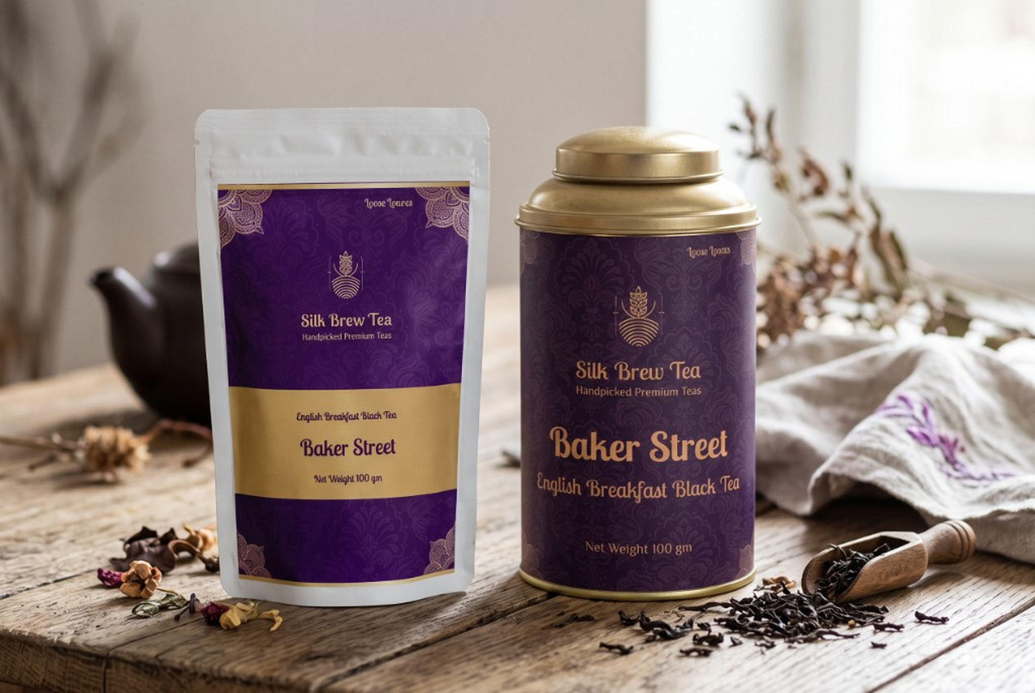
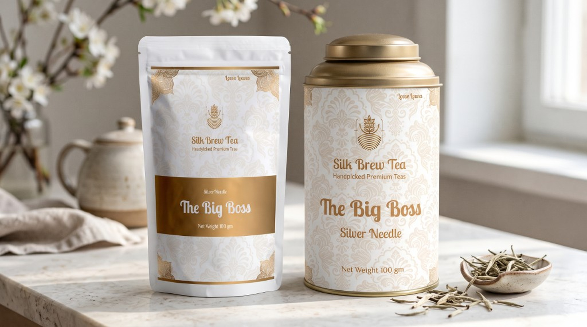
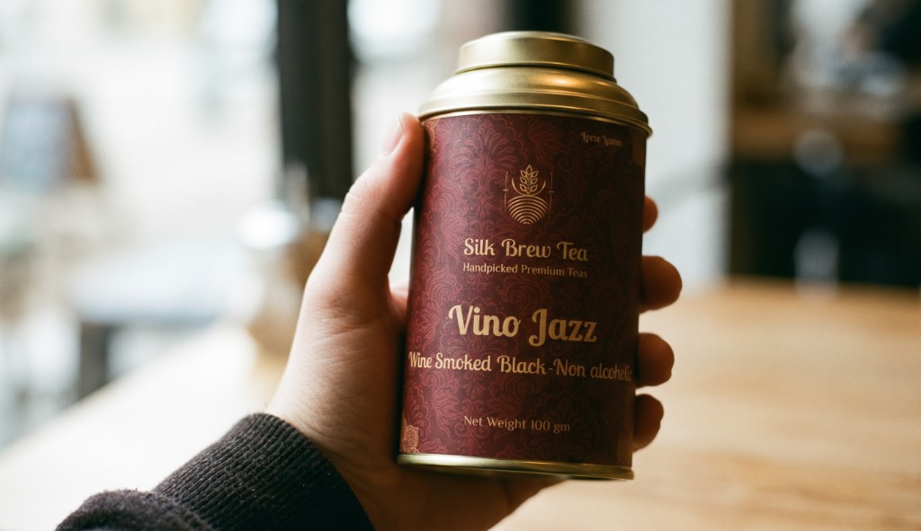
I explored how the catalogue’s visual identity could translate into packaging, refining the use of colour, typography and graphic elements to maintain consistency across both formats. Through this process, I focused on differentiating the tea varieties while preserving a cohesive brand language, balancing shelf appeal with clear product communication to create a unified presentation across the collection.
Catalog Design
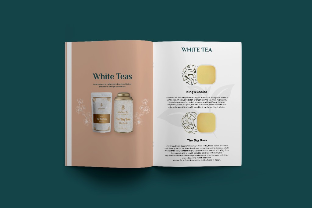
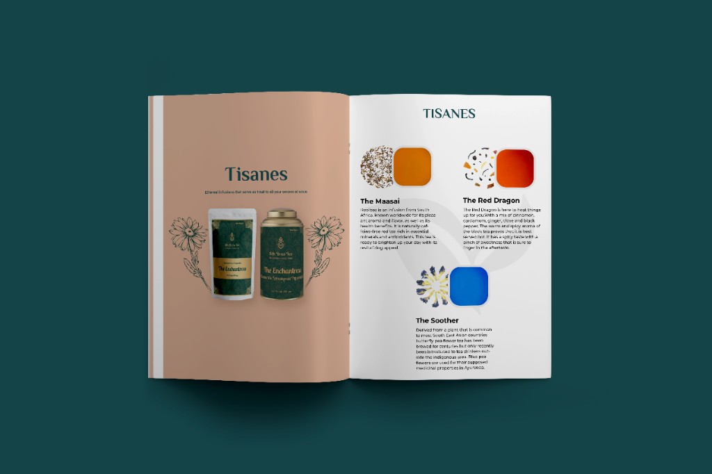
I developed a consistent layout system to organise the tea range, using structured grids, considered spacing and recurring graphic elements to create continuity across spreads. The system provided a clear framework for presenting different tea varieties while allowing each product to maintain its own visual character.
I organised product names, descriptions, details and imagery according to their importance, making the catalogue easy to navigate and product information simple to digest. By balancing clear typography and structured layouts with expressive imagery and colour, I created an editorial experience that was both informative and visually engaging.
Outcome
The final design brings the branding, catalogue and packaging together through a consistent visual language. I made deliberate decisions around colour, typography, imagery and layout to ensure each touchpoint felt distinctive yet connected to the same identity. The result is a cohesive brand system that carries the visual character of the tea range across both print and packaging, balancing editorial expression with clear product communication.
Design Principles
01
Clear hierarchy
Product information should be easy to scan.
02
Consistent system
Each spread should feel part of the same collection.
03
Visual distinction
Individual tea varieties should have their own character.
04
Editorial balance
Photography, typography and negative space should work together rather than compete.